Return to MenuNext Recipe
05 · UX Research & Design

Interactive Atlas Onboarding

A non-linear, interactive onboarding system designed to simplify complex data visualizations for novice users, using the IPCC Interactive Atlas as a case study. Grounded in educational theory and user-centered principles, it bridges the gap between academic research and real-world usability.

Role
Interaction Design, UX Design, UX Research
Year
March 2024
Ingredients
Figma · Vue.js · Node.js · user research · educational theory
Price
€24

Pain Points

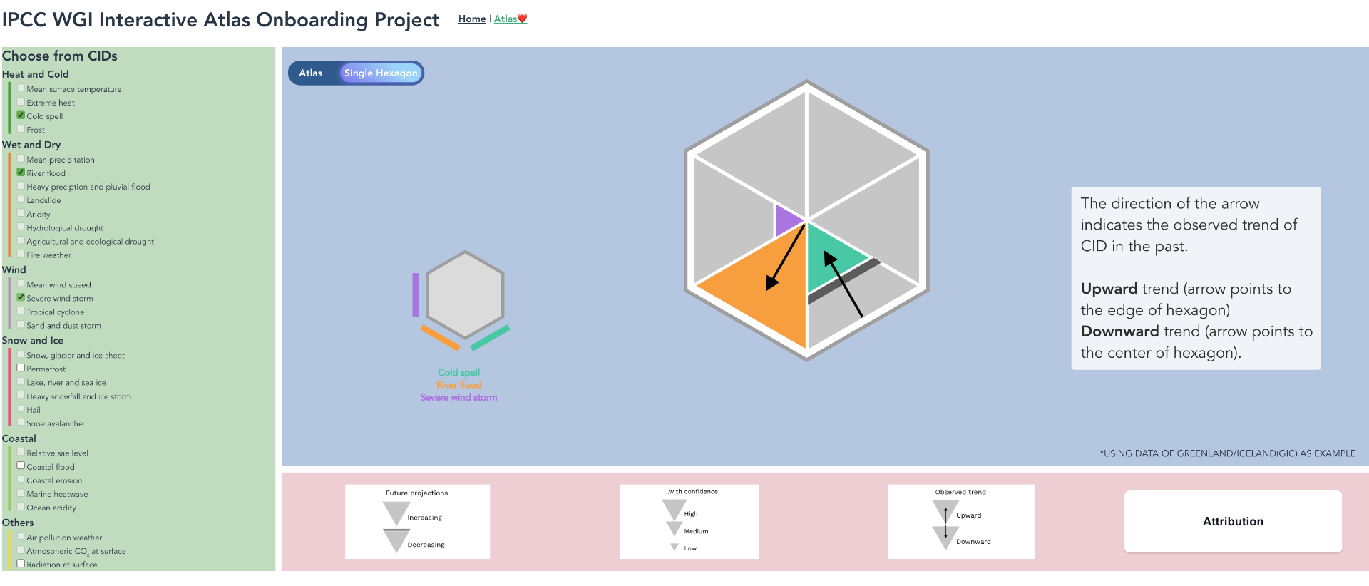
Interactive visualizations for complex datasets, climate data in particular, often rely on unfamiliar representations and dense encodings. Generic guides or explanatory text rarely close the gap, which limits how much insight people can actually extract from the data.

01

Challenges

Interactive visualizations for complex datasets — climate data above all — often rely on unfamiliar formats and dense encodings that don't map to anything users have seen before.

02

Limitations

Basic guides and explanatory text aren't enough to help users navigate interactive, unconventional visualizations once the encoding gets layered.

03

Insights

Effective onboarding can sharply improve a user's ability to read the visualization and make informed decisions from what's actually shown.

Objective

Develop an onboarding method that improves comprehension and engagement, making complex visualizations accessible to novice users. The IPCC WGI Interactive Atlas was chosen as the case study, as it is both scientifically critical and notoriously hard to read.

Design Space

I built a framework around four key dimensions — Linearity, Progression, Interactivity, and Integration — and placed existing onboarding methods into this space to find the unaddressed niche. The resulting matrix served as both a literature map and a brief.

Design space framework — four dimensions
Existing onboarding methods mapped against Linearity × Progression, then sliced by Interactivity and Integration.
Linearity

Strict sequential walk-through, or free roaming across the content?

Progression

Drip-feed information step by step, or lay it all out at once?

Interactivity

Passive reading, or hands-on exploration with feedback?

Integration

Bolted-on tutorial, or stitched into the visualization itself?

Case Study

The Interactive Atlas combines a hexagonal world map with each hexagon split into six triangles, each one mapped to a Climate Impact Driver (CID). A left-side legend decodes which CID lives in which triangle; a bottom legend explains trend and confidence. The encoding is powerful but unfamiliar — far from a bar chart or line graph — and forces users to juggle multiple abstract layers at once. For anyone outside climate science, that complexity is exactly where onboarding has to step in.

IPCC WGI Interactive Atlas — Regional synthesis
The IPCC WGI Interactive Atlas: hexagons split into six triangles encode climate-impact drivers; arrows, opacity, and grouped legends layer in trend, confidence, and attribution.
Hexagon decomposition from 1 to 6 CIDs
Breakdown: a single hexagon is decomposed into one to six Climate-Impact Drivers (CIDs), introduced anticlockwise. Each new CID adds a colour to the legend without resetting prior context.

Design Methodology

Five principles guided the onboarding design: decomposition and modularity to surface one feature at a time; a top-down structure so users start with the whole before exploring the parts; active learning over passive reading; and concrete examples to ground abstract encodings.

Design methodology principles
Five guiding principles: decomposition & modularity, one feature at a time, top-down structure, active learning, and concrete example.

Prototyping

Two high-fidelity Figma prototypes were designed around different decomposition strategies. They were tested back to back to compare a top-down walkthrough against a modular re-composition flow.

Prototype 01 · Top-down decomposition

Starts from the whole visualization, then walks the user inward feature by feature.

Open in Figma ↗
Prototype 02 · Modular re-composition

Introduces components in isolation and lets the user re-assemble the encoded hexagon themselves.

Open in Figma ↗

Web Application

The stronger prototype was implemented as a Vue.js web application. It guides users through the Atlas step by step, lets them toggle CIDs one at a time, and surfaces contextual explanations for trend, confidence, and attribution as each layer is revealed.

IPCC WGI Interactive Atlas Onboarding — web application
The live application: a single-hexagon mode walks users through one CID at a time, with contextual side panels explaining trend, confidence, and attribution.
Get started ↗